I decided to use my hand broken type to my advantage, and have decided to have a photoshoot, which should allow me to create a poster for the ministry of sound that is influenced by typophoto.
I want it to seem hand made. rough. sketched. and fluid.
Tuesday, 17 April 2012

Tuesday, 10 April 2012
More try outs


I feel like these are much better.. however i still need 2 develop more..
The middle is horrific!!!!! the text is nice tho!
Light show / subwoofer (sound system) typographic experiments

ok.. so yeah.. its not very readable is it?.. argh..

Still not very readable

Its gettin better... im gonna try it with 90's colours and see what happens.
also im gonna try make the circles less visable (possibly the illusion of vibration?)
Sunday, 8 April 2012


Wednesday, 4 April 2012
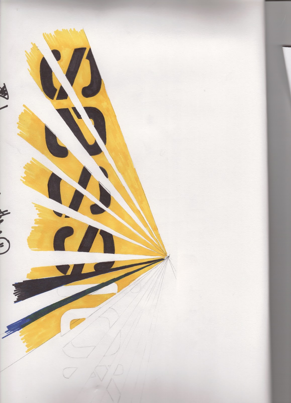
Breaking it up? - am i on to something?

Ive used 1 point perspective to symbolise the rays that are commonly found in a lazer show.
with further work. i could create a really nice piece of design, that is inspired by the laser shows - yet has nothing to do with slow exposure.
im still gonna try things out though XD
Thursday, 29 March 2012
Crappy Tryouts


Thursday, 15 March 2012


Subscribe to:
Posts (Atom)