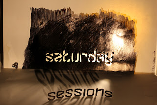
I like the lack of colour in my photographs atm.
I think the way to create impact with the type is to use colour.
however i have to get a font that works well with my photographs
Sunday, 29 April 2012
Monday, 23 April 2012
Anatation
The thing is.. that i have spent all that time creating a really nice piece of typophoto. I don't want to ruin it by simply placing the ministry of sound logo on it and the dates etc.
So what can i do to create a really nice vintage piece of design that wont be ruined by the ministrys horrific logo <- fyi its true!
So what can i do to create a really nice vintage piece of design that wont be ruined by the ministrys horrific logo <- fyi its true!
Tuesday, 17 April 2012
Typophoto
I decided to use my hand broken type to my advantage, and have decided to have a photoshoot, which should allow me to create a poster for the ministry of sound that is influenced by typophoto.
I want it to seem hand made. rough. sketched. and fluid.
I want it to seem hand made. rough. sketched. and fluid.
Tuesday, 10 April 2012
More try outs
I feel like these are much better.. however i still need 2 develop more..
The middle is horrific!!!!! the text is nice tho!
Light show / subwoofer (sound system) typographic experiments
ok.. so yeah.. its not very readable is it?.. argh..
Still not very readable
Its gettin better... im gonna try it with 90's colours and see what happens.
also im gonna try make the circles less visable (possibly the illusion of vibration?)
Sunday, 8 April 2012
Wednesday, 4 April 2012
Breaking it up? - am i on to something?
Ive used 1 point perspective to symbolise the rays that are commonly found in a lazer show.
with further work. i could create a really nice piece of design, that is inspired by the laser shows - yet has nothing to do with slow exposure.
im still gonna try things out though XD
Subscribe to:
Comments (Atom)


