www.conradshawcross.com
some seriously cool light shaddow ideas... that is possibly.. where i should go... rather than show expossure... however i shall still try out lots of different methods
Wednesday, 22 February 2012
Friday, 17 February 2012


Ideas coming to life.
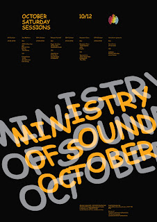
After researching previous designs, typography, experimental, slow exposure, structured etc, i thought it was about time that i looked into what styles of fonts ministry of sound usually use.
Usually they use a structured san serif stencil style font. however when it comes to an anniversary they tent to celebrate this by using a classic serif styled font.
Because my brief specifically says that the Ministry of Sound is 21 this year. I believe creating a font in a most classy yet contemporary manner, may suit the client.


Monday, 13 February 2012
More inspriation


This design is really cool, i think that the possiblity of creating a slow exposure design like this could be quite simplistic to create, and would tie in really well with the laser shows at Ministry of Sound.


and ofcourse.. i'll have to try something like this.. just cos its COOL!
Wednesday, 8 February 2012
Illustrative type
I also had a idea about illustrative typography, and found some images that i thought i could possibly get an idea from.


More inspiration
Ok.. so ive been looking more and more into experiemental typography and found afew images that i think are really cool so i'll just post them up the now.


Thursday, 2 February 2012
Ideas started to flow.
Ok, so i think i've finally decided that i'm doing the ministry of sound for my personal project, and i've been looking at some of there previous advertisement campaigns.
They're awrite, lots of different versions, from illustrative to full on photography - I've got some favourites, but it's hard choice.
Been looking at different types of fonts, different methods in which they create the poster designs.
But i found an image on google thats really inspired me, and its to do with photographic long exposure... I think that if pulled off right, it could look pretty cool!
PEACE OUT.


Subscribe to:
Comments (Atom)